So design is important for business.
I know what you’re thinking.
What if I can’t afford to hire an expensive designer?
Should you DIY your landing page, hoping that it won’t look 100% hideous?
Well, maybe you don’t have to.Fortunately, there are templates available that not only look nice, but also won’t exactly murder your conversion rates. Regrettably, they are often well-hidden.
I analyzed 10 of the top-selling landing page templates – and my comments are here for you to learn from. They are based on the research made by big conversion sites like Social Triggers and CrazyEgg.
Before we move along, I need to let you in on two ‘secrets’ first.
According to what sells right now (see below), you’ll be in the top 20% marketers knowing these facts.
Ready?
First, there is a difference between sleek-looking design and design that actually converts. Many designers tend to ignore the latter and get stuck in the ‘nice-looking’ stage – or simply don’t know about CTAs and A/B testing.
I suppose design colleges don’t teach about these things.
And second, landing page is a single page – not a bundle of pages that make a site.
It’s simple. If you’re looking to sell something, you want a focused, one-offer page. I’m afraid many buyers of these top-selling templates actually wanted to buy a much cheaper website template, not a landing page.
You’re not really getting ‘more value’ by buying a multi-page template. If used for any kind of marketing, you’re getting wasted clicks.
Now we can continue to my ruthless rip-apart. I took 10 best-selling templates on ThemeForest, listed under ‘Landing pages’ and sorted by sales. The best selling template has nearly 2000 sales at the moment of writing this post so I’d say there’s quite a market for these things.

The oftentimes ‘chinglish’ copy obviously can’t be a part of this critique. And you’ll see me commenting on parts that could or should be thrown out, modified, and mixed-and-matched. I am aware of this.
I am referring to the overall layout, not what could be done with it. Take these remarks as pointers on how to improve each template should you decide to buy it despite my harsh observations.
And now, to the top 10.
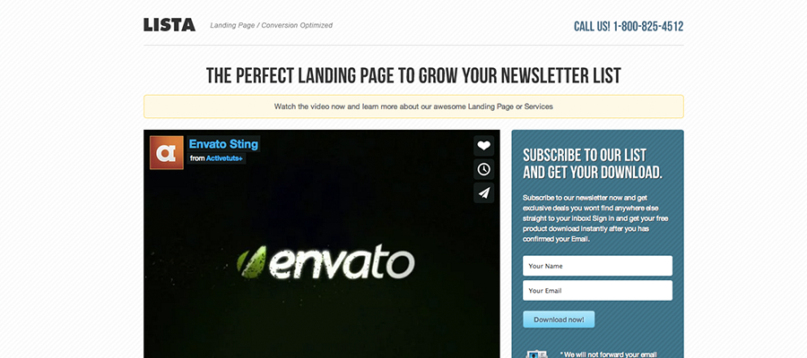
Lista | Newsletter Form Landing Page
Ok, first of all, I’m not exactly sure what makes this one the most sold landing page template, but it’s definitely not the description:
As is dramatically however the differences between these Landingpage with video and without video, is real impressing.
LOL.
Here are the rest of the remarks:
‘Call now’ diverts attention away from the primary call to action which should be subscribe to our list (by the way, you can do that ). And I’d definitely not need phone support for filling out a 2-field form. Another unnecessary CTA is in the footer – links to social networks. Do you really want your visitors to like you on Facebook instead of signing up for the list? I hope not.
‘Download now’ button should be in a contrasting color to increase conversions. Blue on a blue background is a dismal no-no, even though I perfectly understand designers’ itch to make it ‘fit’.
Form could use a few further improvements. Reducing the number of fields to one is one, experimenting with different button labels is another. On the positive note, putting the form into a box to focus attention on the CTA is a smart move.
Facebook comments can serve as a social proof, but only until you get one dissatisfied customer (or a troll). So unless you’re willing to manage these comments day and night, you might be better off just adding believable hard-coded testimonials.
Beneath the fold. To be frank, I don’t really see the point of anything below the video. If your video was unable to persuade them to give you your email, are you sure the rest of the page will? But I’ll leave this up for you to test.
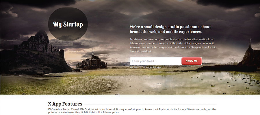
Landing Soon
I’ll talk about this variation of the template.
- I’d hate to be a slider these days. They kill conversions and so everyone hates them. Well, not everyone- designers are unfortunately still pretty keen on using them in their designs. Sigh.
Again, a non-contrasting CTA. This is getting boring quickly. Even the pricing table has an extremely uninviting button.
Not a landing page. Let’s face it – this is not really a landing page. It’s a rather badly designed one-page website that would never get this amount of sales if it had been listed under regular HTML templates.
Lack of focus therefore doesn’t come as a surprise. Showing off the team, gallery, social icons, multiple CTAs, … All of these would drive conversions into the ground – if this was an actual landing page, anyway.
Testimonials should ideally feature an image of the person giving it to add more credibility. Anyone can quote John Doe from the Neverheardofit Company and add a fictional testimonial, so you better find a way to make yours believable (video testimonials, for example).
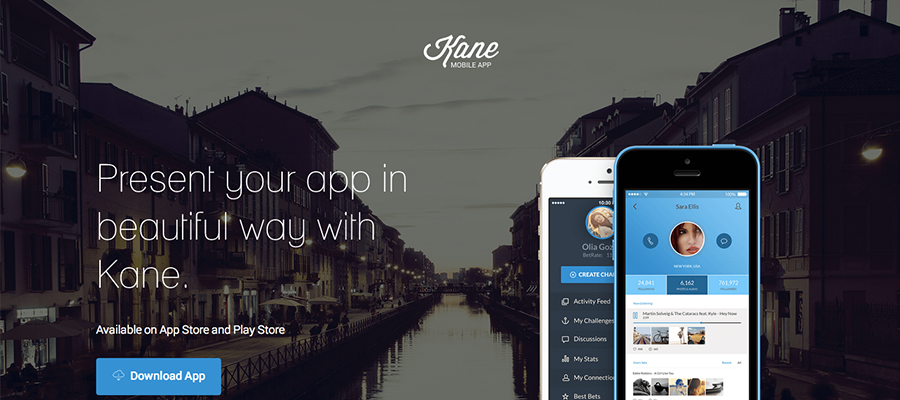
Kane – Responsive Bootstrap 3 App Landing Page
Now this is what I call sleek. I wouldn’t be surprised if this layout got one of those web design awards. But marketing awards? Not so much.
The CTA button doesn’t stand out. Coloring it orange and making it look more 3D might fix this problem. But it won’t fix the double call to action. Do you want me to buy this app or sign up for your newsletter or maybe even contact you? I think I’ll go like your Facebook page instead. BAM! I’m gone and your $0.40 per click just went down the drain.
Parallax – Now I don’t know about you but I find parallax scrolling super-annoying when I’m looking for info. I noticed even some blogs started using it and I normally just close the site.
Admittedly, this might be the best template so far. It has nicely designed testimonials and presents app’s features nicely. I don’t see the point of rotating the contact form at the end, but oh well.
Conversion – Premium Landing Page
This is the version I’m talking about here.
To be honest, this page is almost as ugly as the number 1 on this list. Its design is pretty generic, but in some cases you want that – especially with templates.
I hate to repeat myself but this CTA button is only slightly better from the previous candidates’. Dark background brings it out more, but changing it into orange might still be the best solution.
Distracting elements. Since we want our visitors to sign up for the trial, social network icons and contact number are completely redundant. Same goes for that footer with additional unnecessary content just thrown onto the page.
Also, those testimonials don’t look persuasive at all. Actually, they seem like somebody made them up. Adding images and quote marks around them would immensely improve this design.
In short, I wouldn’t buy this template.
Let’s hope the next one restores my hope in … well, in template designers.
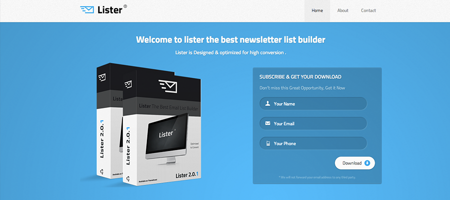
Lister – Premium Landing Page
Again, a multi-page website. But I’ll review its home page in case someone accidentally bought this for their landing page.
CTA button. Make it stand out more.
Number of form fields. Lower it.
Navigation. Rip it out and throw in trash.
Social icons. Don’t make me repeat myself.
Not sure if this is the case in this template, but testimonials should ideally not have links in them to avoid distracting the visitor.
This template is not particularly ugly, though. It also has a nice mockup of the product, which is great (you should always show an image of what you’re selling). With a couple of changes this one could actually convert well.
Off the Shelf – Responsive E-Book Landing Page
I think this one is my favorite. CTA button stands out beautifully and is being repeated multiple times. There are spaces for testimonials, features, media mentions, and many more segments that can’t be missing from a landing page. Lots of emphasis is put on product images which brings even more points to this template.
There are only a few remarks that I have: social icons at the top and the ‘Sign up for the newsletter’. This is something worth testing thoroughly, but generally you should stick to a single offer – for example, ‘Buy now’.
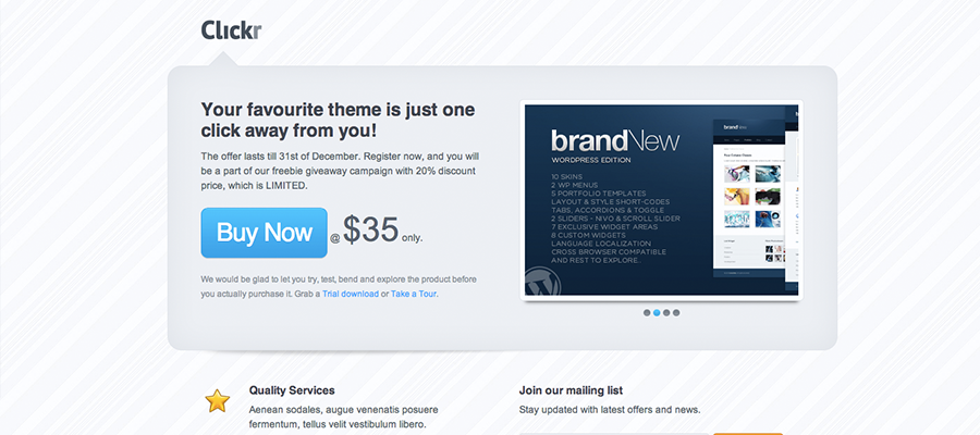
Clickr Landing Page
Ugh. Those sliders in this version make me want to cry. But that’s not all.
The best way to use this template would be as a squeeze page. Anything below that box should be thrown out as it’s only a distraction to the primary offer – which is ‘Buy now’.
Testimonials look pretty unpersuasive, like so many on this list. And you should forget those social icons.
And it’s not responsive, so I don’t think this template quite makes the cut. Next!
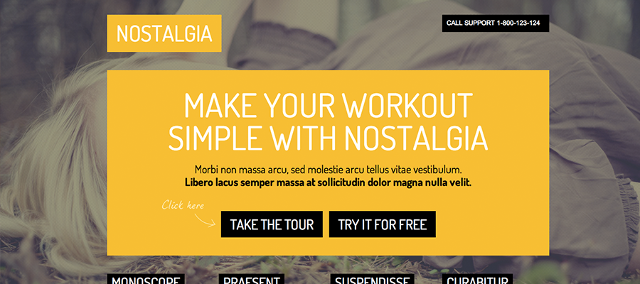
Nostalgia – Responsive Landing Page
Here we have yet another one-page website, and a hard-to-read one. It’s difficult to figure out what is the offer of this page – do they want me to contact them or call them or sign up for their newsletter or maybe take the tour of their product? Enormous amounts of bright yellow makes it all that much harder to comprehend.
Testimonials’ and button design are another problem addressed in the previous critiques. I expect this so-called ‘landing page’ will waste so much of your advertising money it’s not even funny. Move on.
Neue – App Landing Page
Another one of those sleek landing pages with fancy scrolling animations. Let’s see how it would perform conversion-wise.
Call to action button does not stand out, but rather blends in with the rest of the page. Making it into a filled black or dark blue button would definitely make it stand out more.
Throwing out that ‘Subscribe to newsletter’ might also be a good idea (and repeat the primary cta at the end of the page).
According to the benefits vs. features principle of copywriting, this template puts too much emphasis on features. Swapping that out for a couple of images of real customers along with some copy about how will this app help them solve a problem might make this template convert better.
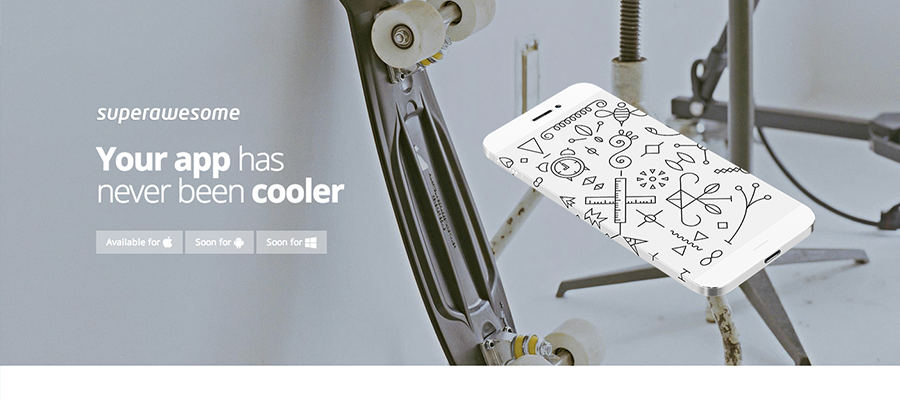
Superawesome – Retina Bootstrap 3 App Landing Page
This template was built with Bootstrap and has many small surprises, like animation and that annoying parallax scrolling effect. It leads the eye through it quite nicely through the page, though – there are no distractions.
I don’t see the point of those three stock men in the footer. They don’t really add anything relevant to the copy, so why are they even there? I’m sure not many people believe those are your real customers. And are those testimonials supposed to be from these stock people?
Contact us part doesn’t belong on a landing page, and the same with social icons.
So there you go, 10 top templates reviewed. You may be asking,
How to Pick the Best Template?
Well, it helps to know some basic principles of making landing pages convert. To learn about those, I encourage you again to sign up for my newsletter (beneath the post) so that I can send you a free video on Hacking Conversions. Go ahead, I’ll wait here.
In addition to those important and essential principles, here’s a run-down of criteria you should definitely consider before hitting the ‘Buy this’ button.
- Think about how will each design work with your logo and any existing branding (See #2 in this post)
- Think about which content will you need to produce to fill in the template. Don’t get a template with space for video if you don’t plan on producing one – these kind of last-minute changes of heart have ruined many of the templates I had bought
- Refer to this post for pointers on what makes a good template: a single offer, no distractions, social proof must be believable, etc.
- Again, landing page != company website
Now you can go out, armed with this new knowledge and pick the best template for your product.
Design, but simple.
My popular design ebook is now on sale. Don't miss out!
